I believe very strongly that e-commerce relies on trust; customers trust us with their money and with their data. Any unusual, unexpected aspects of an ecommerce transaction flow introduce a risk that the customer could become disoriented, distrustful, and ultimately abandon the transaction or–even worse–tell others to avoid the site entirely.
Creative Market, like so many smaller e-commerce organizations, had historically relied on A/B testing to validate product feature success. When I arrived, it appeared that this approach had led to some unorthodox results.
I worked with my team and colleagues to make the case that the current experience was injecting doubt into the transactional process by confronting customers with an unexpected and unusual experience.
Trust was in jeopardy.
Data downer
In my experience, 3.5% conversion rate is a good benchmark for a healthy e-commerce site’s. In the summer of 2019, Creative Market’s conversion rate was hovering somewhere in the 2.4% range. Based on lagging performance, I targeted our transactional process as a critical area for design improvement. Our team had also identified additional performance issues, and we struck out to affect performance during the redesign process.
Listen to Customers
In conjunction with our growing research practice, we began to hear more feedback from customers. We engaged in contextual inquiry while using our current experience and yielded qualitative insights on the anxiety and suspicion that arose within our existing transactional process. Customers immediately gravitated to some of the unorthodox parts of our transaction and called out issues.
For instance, when customers arrived, we prompted them to create an account at unexpected times. “Why do you keep asking me to log in? Or sign up? I’m just looking around.”
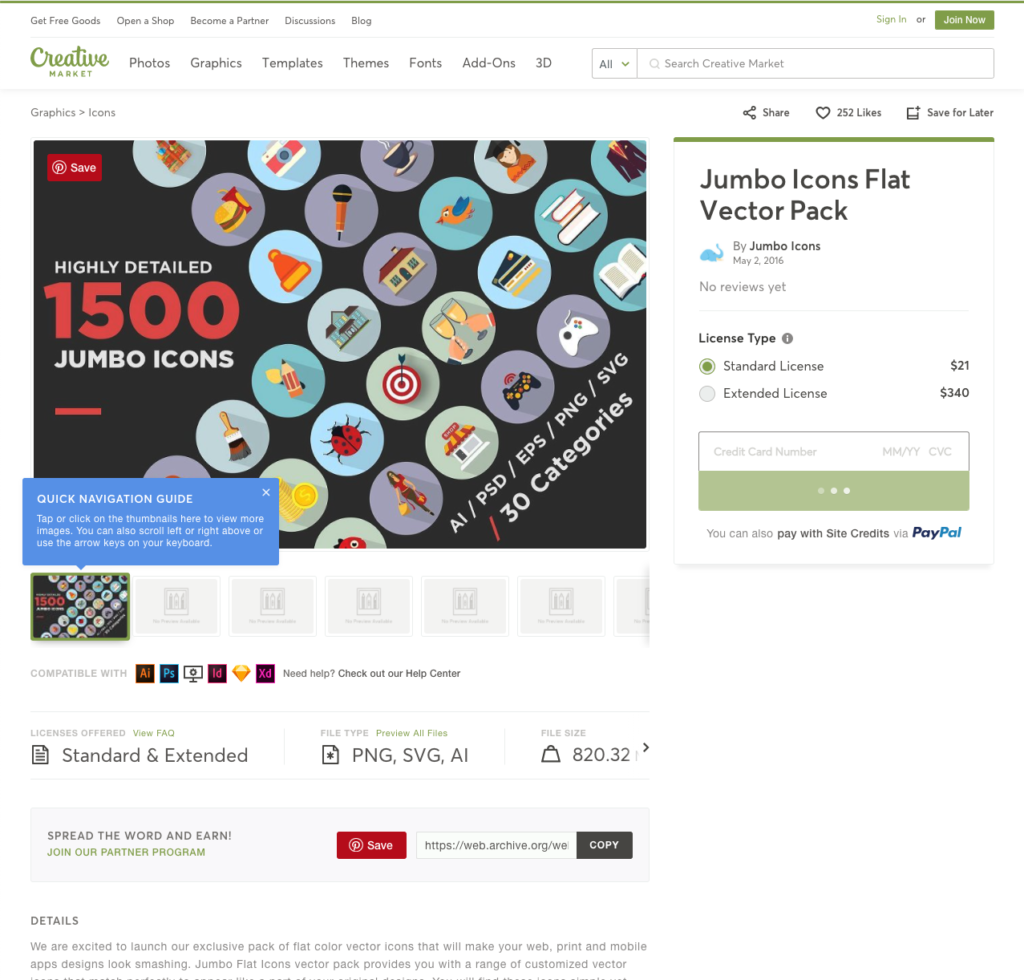
The product detail page, a critical conversion tool, included a credit card field—a highly unorthodox design. Participants spoke up. “Asking for my credit card? I just got here. This looks like a scam.”
Find an objective voice
We had quantifiable benchmarks that showed we were underperforming, and now had qualitative insights that we were jeopardizing trust in the transaction flow. We solidified the argument by reaching out for an objective perspective.
The Baymard Institute has conducted tens of thousands of hours of usability testing on e-commerce sites. They offer their consolidated findings as a set of guidelines, made available by subscription. These guidelines gave our team the valuable neutral voice to demonstrate that our transactional experience was far out of band from the expected and accepted e-commerce practices. With this evidence, we successfully argued in favor of a strategy of normalizing the transaction flow.
Show the (rough) future, then refine
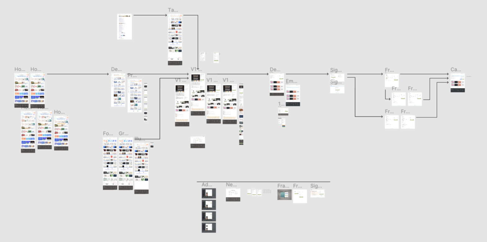
I drafted a high-level diagram of the intended experience, simply using screen grabs of our existing experience, modified to demonstrate an intended future state. We adopted a typical e-commerce transaction flow, both in payments and in how we prompted account creation.

Our Senior Product Designer took the transaction flow head-on, merging the synthesized qualitative analysis with new design direction. The engineering team worked to rebuild key components of the transactional workflow from scratch to be both faster and more secure.
A before and after example…

The former product detail page design 
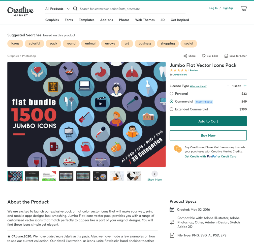
The current product detail page design, designed by Stef Angeles
While the project extended the entire transactional flow, the product page is a good example of the level of impact the team could make; removing unorthodox aspects of the design, such as a credit card input on the product page and aligning with ecommerce norms.
What worked
The improvements to the transactional experience yielded results in the form of significantly improved conversion, 40% – 130%. depending on the population represented in the analysis. Our community of shop owners generally appreciated the improvements to the product detail page and overall transactional flow.
As an additional benefit, we launched these improvements along with many others in the middle of 2020, as the economy saw massive disruption. While traffic to the site remained relatively flat, conversion gains helped buoy the business through tumultuous times.
