In the time I was at Renovate America, the regulatory and market environment for their PACE financing product went through tremendous changes. In the fall of 2017, I employed a design sprint with a cross-functional team to handle one of the more complex challenges facing the company. What is a design sprint?
The problem
Once the regulations take effect, we would need to make changes to our application process by:
- ask each applicant their income
- verify each applicant’s income
- use that income information to determine the amount that we will approve
So, why do a design sprint?
I love conducting design sprints with diverse, cross-functional teams of stakeholders and I especially love using this method when the problems are complex, boring, ambiguous, or otherwise difficult.
In short, it’s a five day process that starts with a team tasked with solving a problem, and ends with real-life feedback on one of the proposed solutions (it may be helpful to get to know design sprints, if you haven’t already).
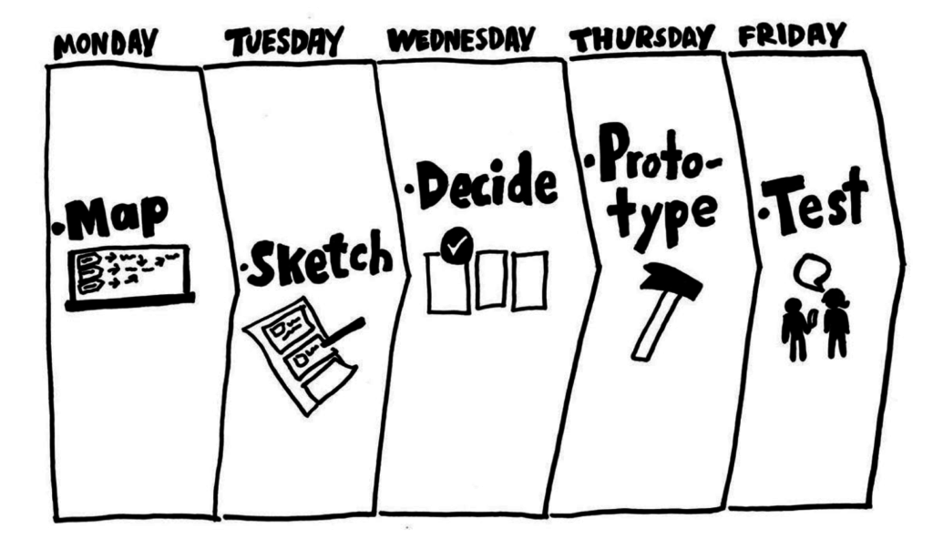
A design sprint was a fitting process for a few reason.
- The stakes were high. The regulatory changes would affect our flagship financial product
- It was a delicate balance. The application process for financing can be stressful for customers. We had to assure we had the most comprehensive perspective on the process to assure we weren’t creating any additional barriers.
- It affected multiple parties. We needed to address the multifaceted nature of these changes both across multiple internal and external channels and the impact over the course of the transaction workflow.
A design sprint is uniquely outfitted for addressing this range of challenges, as the process takes all affected stakeholders and customers into account, while guiding the team through discovery, ideation, prototyping, and testing together, as a team.
Get ready!
I made my case for the design sprint technique and from the onset, I gained buy-in from a senior product manager who would ultimately own the workflow, and the SVP of product who was overseeing the implementation of new regulations onto our digital experience. In preparation for the sprint, I aligned resources in three areas:
People: While I was acting as our facilitator, I included two “deciders,” the critical stakeholders who could break an impasse in the group if necessary; the SVP of Product and the Director of Program Services & Operations (customer service). Next, we reached out to individuals we saw as valuable members of the “core team,” especially those that would ultimately carry the responsibility of seeing the ultimate product come to fruition. We worked with their supervisors to arrange for their participation. Finally, we aligned a roster of subject matter experts, sketching session participants, and user testing participants.
Logistics: I secured a conference room with two whiteboard walls for a period of two weeks, tracked down all the post its, markers, and other supplies I needed to get ahold of, and of course, stocked the room with snacks.
Wiki: Before kicking off, I prepped a series of pages in our wiki to receive and align all the findings that would come out of the session. The page organization of the wiki aligned around the schedule.
- Design Sprint Main page & output
- Day 1: Ask the experts, How Might We
- Day 2: Hypothesis alignment + Sketching
- Day 3: Storyboarding + Prototyping
- Day 4: Prototyping
- Day 5: Testing + Review
- Afterparty: Retro
Once this was set up, it acted as the backbone for the entire sprint, a single resource for reviewing the output of the day.
We mapped out the experience that would act as the focal point for our experts and we were ready….
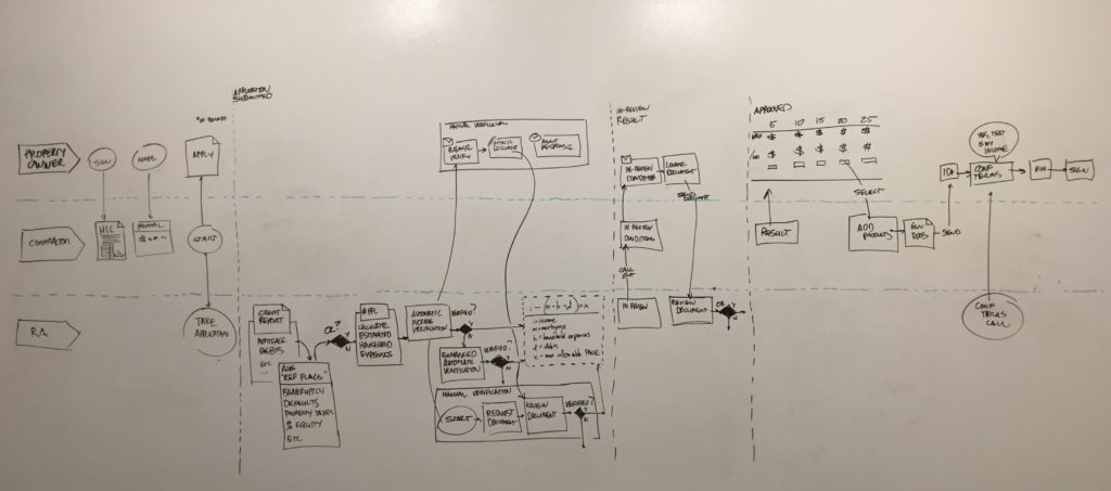
Rows of the experience are different user groups, and the experience is essentially mapped as a flow chart as it impacts those users. This is a typical approach to service design journey maps, or multi-channel user journey maps.
And we’re off…
We conducted the design sprint with some modifications to the advised format and ultimately had incredible results.
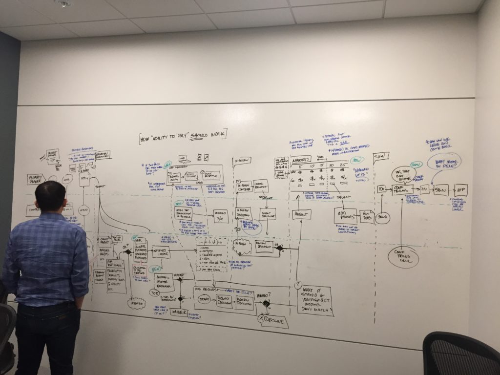
People who rarely share their perspectives with each other had the opportunity to see the broader picture of the experience, thanks to the process of walking through the service map. The team could collaborate, argue, refine, and ultimately support a new direction.
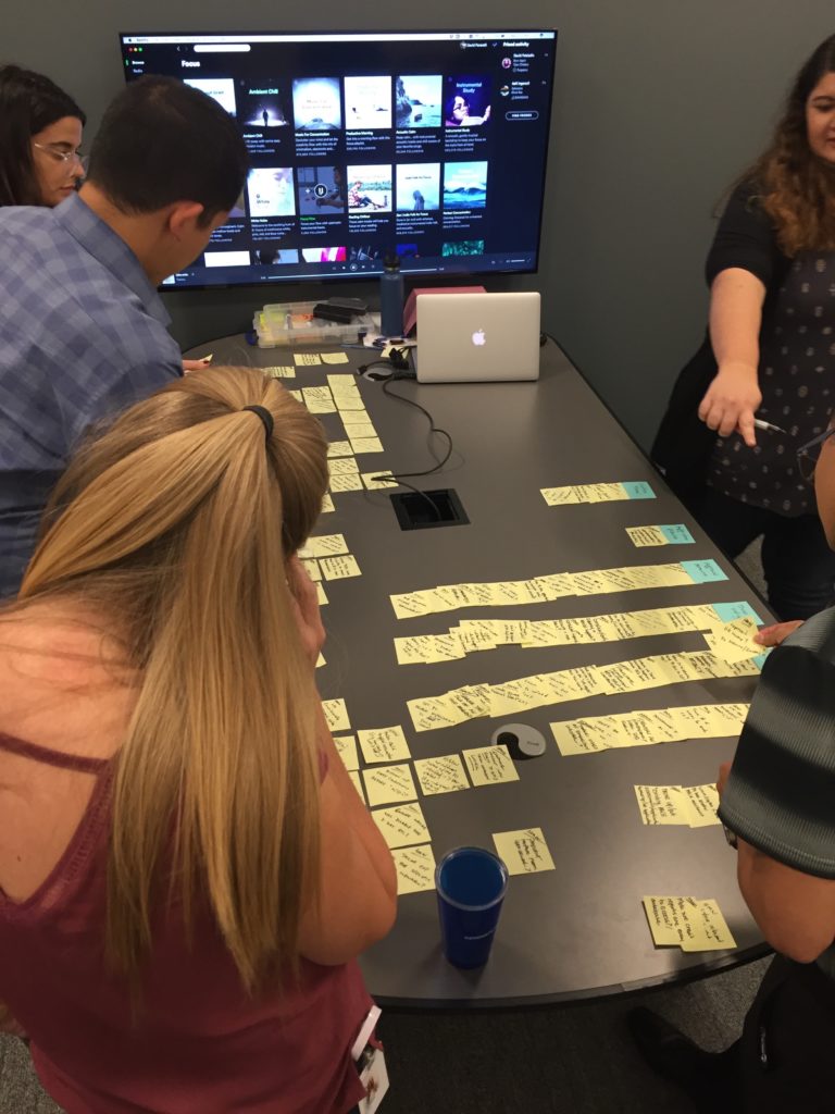
The team identified nearly 150 opportunity areas within the application process, aligned them into affinity groups, and identified where the most urgent needs were found.
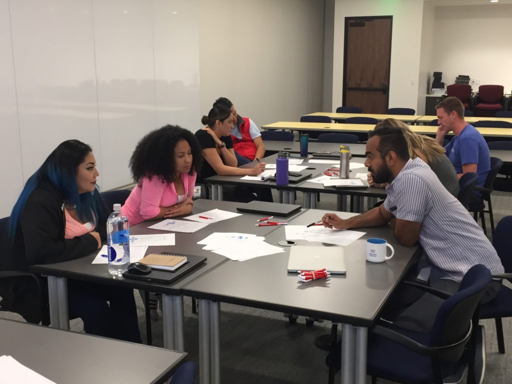
Through sketching and rapid prototyping, people who rarely have the opportunity to contribute to the strategy felt a sense of opportunity and ownership as their contributions were made known in the path forward.
The outcome
The team ultimately identified that the customer-facing digital experience for income verification was a critical point for success. The process also highlighted other key areas where the process could break down, so a prioritization decision had to be made.
The income verification experience was something we didn’t have at the time, but needed in order to be compliant with new regulations. We needed to learn, as quickly as possible, what our customers’ tolerance would be for submitting sensitive financial documentation.
We built a prototype in InVision and tested internally, focusing on contextual inquiry from stakeholders who work with customers daily. The input was synthesized and prepared for the product team. Our direction moving forward:
- Use tech to smooth out the process. We emphasized using technology behind the scenes that could accelerate the income verification process, or remove the barrier altogether.
- Give the applicant control. It was critical to create a tool for applicants to use on their own, on their own mobile device or computer.
- Give the applicant a job. The preliminary direction emphasized a to-do list format for the applicant, guiding them through the process of getting a successful application result.
Retro
Ultimately, the sprint has two major outcomes. First, deep insight into the impact of these changes on the product organization and the customer experience in short order. Secondly, perhaps the most valuable outcome of all, was the galvanizing force of alignment across multiple disciplines within the company.
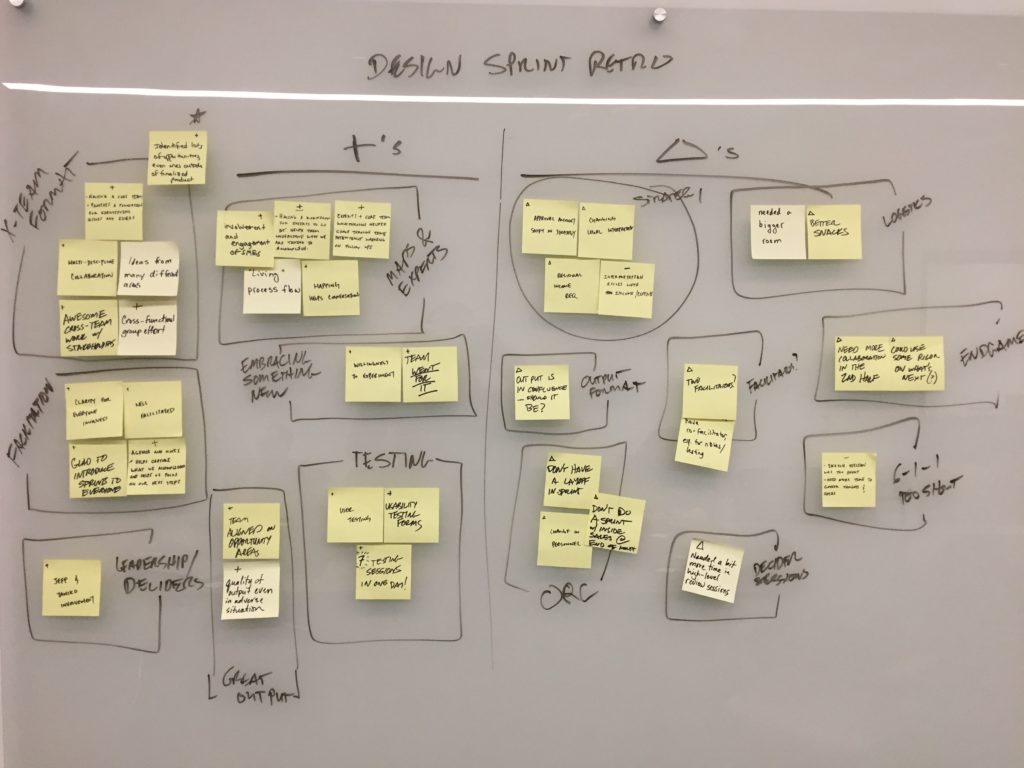
In a retrospective session after the fact, we identified key areas of benefit and proposed changes, setting the stage for the next. The team left with a clear understanding of the problems and excitement for the path forward.
