Summer 2012
Problem
In 2010 and 2011, the company was blessed with “hockey stick” growth. A site originally designed to show one local deal per day now featured dozens, if not hundreds, of deals in hundreds of cities around the globe. The old system was creaking under the weight of its own success.
Solution
We started with user testing. In usability testing, I worked with participants to understand their mental models around LivingSocial’s product offering. This ultimately led to the development of personas that could be used across projects as a whole.
As we began framing a new approach to the site, I used remote open card sorting as a tool for capturing thousands of terms used to describe LivingSocial’s products and the relationship between them.
With research under our belt, I developed a taxonomy based on how our products were viewed by our users.With the new taxonomy, we gained insight into how to present specific types of products back to our customers. Not perfect by any means, but a giant leap ahead of the current system of organizing only by geography and broad product category.
The next issue we wanted to address is that the current information architecture visual design wouldn’t cut it for the company’s new strategic direction: new products and new campaigns were set to launch in the coming months and we knew that the old architecture would be a hinderance to the opportunities ahead.

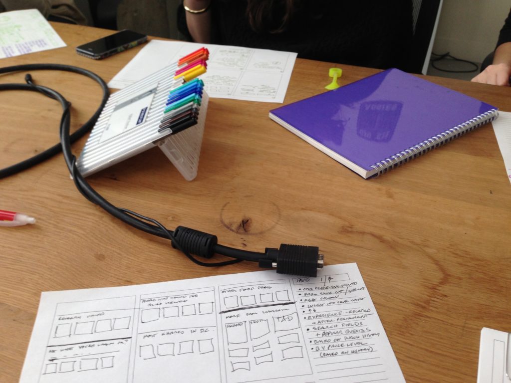
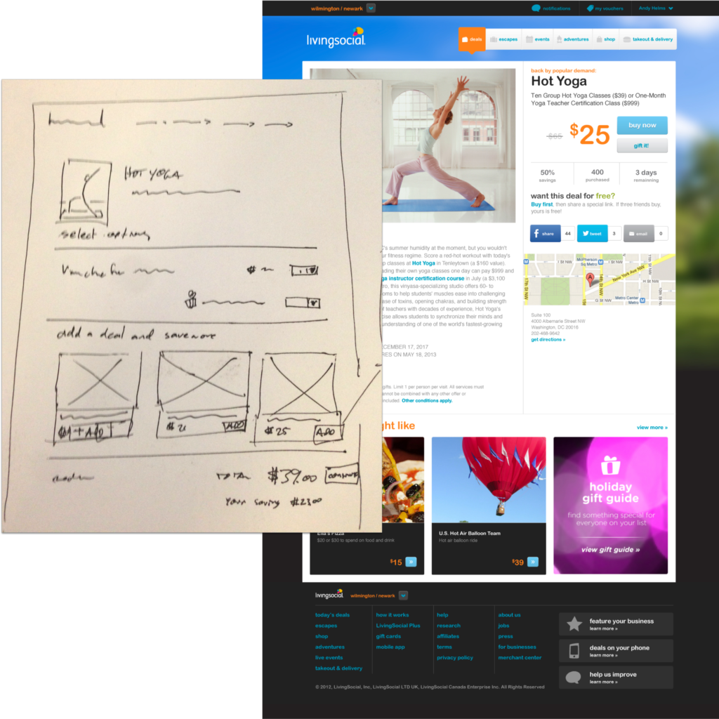
We knew we had to ditch the left-hand navigation where possible and provide a wider page area. We identified the key pages impacted by this page and went to work.

The re-architecture gave the site the flexibility it needed for expanding product lines in new directions and reaching audiences. We debuted the new site on the company’s biggest day ever, a partnership with Starbucks that drove more purchases than any other daily deal.
Team
- Product Lead: Ian Costello
- Engineering Lead: Dan Mayer
- Front-End Engineering: Doug March, Joe Nasser, Eric Brophy, Chris Coleman
- UX Lead: David Panarelli
- Visual Design: Andy Helms
